

- You are here:
- Home

- Program
Program
Location: 301-D
Session 1
8:30-10:10, Session Chair: Carlos ScheideggerOpening Address
Alexander Lex, Torsten Möller

Keynote: Challenges in Data Science
Hadley Wickham, RStudio
Abstract: In this talk, I'll outline my vision of data science as a field,
focusing on the corner in which I'm most familiar: designing tools
for data scientist-programmers. I'll talk about why I believe
programming is so important for data science, why code is an excellent
medium of computation, and outline some of the challenges that visual
tools face. I'll also talk about data science challenges where
programming doesn't help or feels excessively clumsy, and speculate on
how we might fuse the best of programmatic and interactive UIs.
Bio: Hadley is Chief Scientist at RStudio, a member of the R Foundation,
and Adjunct Professor at Stanford University and the University of
Auckland. He builds tools (both computational and cognitive) to make
data science easier, faster, and more fun. His work includes packages
for data science (the tidyverse: including ggplot2, dplyr, tidyr,
purrr, and readr) and principled software development (roxygen2,
testthat, devtools). He is also a writer, educator, and speaker
promoting the use of R for data science.
9:40-09:55
Paper: Visual Analysis of Spatio-Temporal Event Predictions: Investigating the Spread Dynamics of Invasive Species
Daniel Seebacher, Johannes Häußler, Michael Hundt, Manuel Stein, Hannes Mülller, Ulrich Engelke, Daniel Keim
Abstract: Invasive species are a major cause of ecological damage and commercial losses. A current problem spreading in North America and Europe is the vinegar fly Drosophila suzukii. Unlike other Drosophila, it infests non-rotting and healthy fruits and is therefore of concern to fruit growers, such as vintners. Consequently, large amounts of data about infestations have been collected in recent years. However, there is a lack of interactive methods to investigate this data. We employ ensemble-based classification to predict areas susceptible to infestation by D. suzukii and bring them into a spatio-temporal context using maps and glyph-based visualizations. Following the information-seeking mantra, we provide a visual analysis system Drosophigator for spatio-temporal event prediction, enabling the investigation of the spread dynamics of invasive species. We demonstrate the usefulness of this approach in two use cases.
9:55-10:10
Paper: Clear Visual Separation of Temporal Event Sequences
Andreas Mathisen, Kaj Grønbæk
Abstract: Extracting and visualizing informative insights from temporal event sequences becomes increasingly difficult when data volume and variety increase. Besides dealing with high event type cardinality and many distinct sequences, it can be difficult to tell whether it is appropriate to combine multiple events into one or utilize additional information about event attributes. Existing approaches often make use of frequent sequential patterns extracted from the dataset, how- ever, these patterns are limited in terms of interpretability and utility. In addition, it is difficult to assess the role of absolute and relative time when using pattern mining techniques. In this paper, we present methods that addresses these challenges by automatically learning composite events which enables better ag- gregation of multiple event sequences. By leveraging event sequence outcomes, we present appropriate linked visualizations that allow domain experts to identify critical flows, to assess validity and to un- derstand the role of time. Furthermore, we explore information gain and visual complexity metrics to identify the most relevant visual patterns. We compare composite event learning with two approaches for extracting event patterns using real world company event data from an ongoing project with the Danish Business Authority.
Session 2
10:30-12:15, Session Chair: Marc Streit
Keynote: When Should We Trust Autonomous Learning Systems with Decision Making?
Vasant Dhar, New York University
Abstract: As autonomous learning machines become a bigger part of our lives, we
need a framework for evaluating which decisions we should be comfortable
delegating to learning algorithms and which ones humans should retain. It is
surprising that no such framework has existed, given the high stakes involved. I
describe a risk-oriented framework for deciding when and how to allocate
decision problems between humans and machine-based decision makers. The
framework is based on the experiences that my collaborators and I have had
implementing prediction systems over the last 25 years in domains like finance,
healthcare, education, and sports. I also explore the different roles visualization
can play in autonomous learning systems.
Bio: Vasant Dhar is a Professor at the Stern School of Business and the Center for Data
Science at NYU, and Editor-in- Chief of the Big Data journal. Dhar’s research and
practice addresses the following question: when should we trust machines with
decisions? His answers are based on many years of experience with building autonomous
machine-learning- based predictive systems in domains including finance, healthcare,
primary education and sports. Dhar writes regularly about machine learning and artificial
intelligence in the media such as the Financial Times, Wall Street Journal, Forbes, and
Wired.
11:30-11:45
BEST PAPER: Visual Integration of Data and Model Space in Ensemble Learning
Bruno Schneider, Dominik Jäckle, Florian Stoffel, Alexandra Diehl, Johannes Fuchs, Daniel Keim
Abstract: Ensembles of classifier models typically deliver superior performance and can outperform single classifier models given a dataset and classification task at hand. However, the gain in performance comes together with the lack in comprehensibility, posing a challenge to understand how each model affects the classification outputs and where the errors come from. In this scenario, it is not straightforward to understand how each model affects the classification outputs and where the errors are coming from. We propose a tight visual integration of the data and the model space for exploring and combining classifier models. We introduce a workflow that builds upon the visual integration and enables the effective exploration of classification outputs and models. We then present a use case in which we start with an ensemble automatically selected by a standard ensemble selection algorithm, and show how we can manipulate models and alternative combinations.
11:45-12:00
Paper: Visualization of Big Spatial Data using Coresets for Kernel Density Estimates
Yan Zheng, Yi Ou, Alexander Lex, and Jeff M. Phillips
Abstract: The size of large, geo-located datasets has reached scales where visualization of all data points is inefficient. Random sampling is a method to reduce the size of a dataset, yet it can introduce unwanted errors. We describe a method for subsampling of spatial data suitable for creating kernel density estimates from very large data and demonstrate that it results in less error than random sampling. We also introduce a method to ensure that thresholding of low values based on sampled data does not omit any regions above the desired threshold when working with sampled data. We demonstrate the effectiveness of our approach using both, artificial and real-world large geospatial datasets.
12:00-12:15
Paper: Visual Progression Analysis of Student Records Data
Mohammad Raji, John Duggan, Blaise DeCotes, Jian Huang, Bradley Vander Zanden
Abstract: University curriculum, both on a campus level and on a per-major level, are affected in a complex way by many decisions of many administrators and faculty over time. As universities across the United States share an urgency to significantly improve student success and success retention, there is a pressing need to better understand how the student population is progressing through the curriculum, and how to provide better supporting infrastructure and refine the curriculum for the purpose of improving student outcomes. This work has developed a visual knowledge discovery system called eCamp that pulls together a variety of population-scale data products, including student grades, major descriptions, and graduation records. These datasets were previously disconnected and only available to and maintained by independent campus offices. The framework models and analyzes the multi-level relationships hidden within these data products, and visualizes the student flow patterns through individual majors as well as through a hierarchy of majors. These results support analytical tasks involving student outcomes, student retention, and curriculum design. It is shown how eCamp has revealed student progression information that was previously unavailable.
Session 3
2:00-3:40, Session Chair: Daniel KeimPANEL: The value of the human in the data science process.
Jeff Phillips, Hadley Wickham, Vasant Dhar, Fernanda Viegas, Martin Wattenberg.
Moderator: Daniel Keim
2:55-3:10
Paper: CancerLinker: Explorations of Cancer Study Network
Vinh Nguyen, Md Yasin Kabir, Tommy Dang
Abstract: Interactive visualization tools are highly desirable to biologist and cancer researchers to explore the complex structures, detect patterns and find out the relationships among bio-molecules responsible for a cancer type. A pathway contains various bio-molecules in different layers of the cell which are responsible for specific cancer type. Researchers are highly interested in understanding the relationships among the proteins of different pathways and furthermore want to know how those proteins are interacting in different pathways for various cancer types. Biologists find it useful to merge the data of different cancer studies in a single network and see the relationships among the different proteins which can help them to detect the common proteins in cancer studies and hence reveal the pattern of interaction of those proteins. We introduce CancerLinker, a visual analytic system that helps researchers to explore cancer study interaction network. We merge twenty-six cancer studies to explore pathway data and bio-molecules relationships that can provide the answers to some significant questions which are helpful in cancer research. CancerLinker also helps biologists explore the critical mutated proteins in multiple cancer studies. A bubble graph is constructed to visualize common protein based on its frequency and biological assemblies. Parallel coordinates highlight patterns of patient profiles (obtained from cBioportal by WebAPI services) on different attributes for a specified cancer study
3:10-3:25
Paper: Crop Planning using Stochastic Visual Optimization
Gunjan Sehgal, Bindu Gupta, Kaushal Paneri, Karamjit Singh, Geetika Sharma, Gautam Shroff
Abstract: As the world population increases and arable land decreases, it becomes vital to improve the productivity of the agricultural land available. Given the weather and soil properties, farmers need to take critical decisions such as which seed variety to plant and in what proportion, in order to maximize productivity. These decisions are irreversible and any unusual behavior of external factors, such as weather, can have catastrophic impact on the productivity of crop. A variety which is highly desirable to a farmer might be unavailable or in short supply, therefore, it is very critical to evaluate which variety or varieties are more likely to be chosen by farmers from a growing region in order to meet demand. In this paper, we present our visual analytics tool, ViSeed, showcased on the data given in Syngenta 2016 crop data challenge 1 . This tool helps to predict optimal soybean seed variety or mix of varieties in appropriate proportions which is more likely to be chosen by farmers from a growing region. It also allows to analyse solutions generated from our approach and helps in the decision making process by providing insightful visualizations.
3:25-3:40
Paper: Visualizing Sensor Network Coverage with Location Uncertainty
Tim Sodergren, Jessica Hair, Jeff Phillips, Bei Wang
Abstract: We present an interactive visualization system for exploring the coverage in sensor networks with uncertain sensor locations. We consider a simple case of uncertainty where the location of each sensor is confined to a discrete number of points sampled uniformly at random from a region with a fixed radius. Employing techniques from topological data analysis, we model and visualize network coverage by quantifying the uncertainty defined on its simplicial complex representations. We demonstrate the capabilities and effectiveness of our tool via the exploration of randomly distributed sensor networks.
Session 4
4:15-5:55, Session Chair: Adam Perer
4:15-4:23
Short Talk: BlueSky Wanderer: Improving Sensor Data Classification Through Real-time Visualization
Marco Cavallo, Cagatay Demiralp
Abstract: Detecting motor activity in temporal data collected by sensors is an important task in wearable sensor applications. Datasets of sensor data often contain limited information about the usage context of the devices and video validation is not always possible, causing a lack of interpretable ground-truth labels. This lack of context can limit the understanding of sensors data, causing data scientists to make incorrect assumptions or to run machine learning algorithms as black-box models. We introduce BlueSky Wanderer, an interactive visual analysis tool for running classification algorithms on live-streaming sensor data. Our system provides visual and quantitative methods to iteratively reason on classification performance and to develop better intuition about structured patterns in data. In particular, BlueSky Wanderer enables quick debugging, validation, and dynamic fine-tuning of classification models for activity recognition. We use a case study to demonstrate how our approach can improve the development of a set of motion classifiers for monitoring the symptoms of Parkinson's disease.
4:25-4:32
Short Talk: Volumetric Data Exploration with Machine Learning-Aided Visualization in Neutron Science
Yawei Hui, Yaohua Liu
Abstract: Recent advancements in neutron and x-ray sources, instrumentation and data collection modes have significantly increased the experimental data size (which could easily contain 10^8-10^10 points), so that conventional volumetric visualization approaches become inefficient for both still imaging and interactive OpenGL rendition in a 3-D setting. We introduce a new approach based on the unsupervised machine learning algorithm, Density-Based Spatial Clustering of Applications with Noise (DBSCAN), to efficiently analyze and visualize large volumetric datasets. Here we present two examples, including a single crystal diffuse scattering dataset and a neutron tomography dataset. We found that by using the intensity as the weight factor during clustering, the algorithm becomes very effective in de-noising and feature/boundary detection, and thus enables better visualization of the hierarchical internal structures of the scattering data.
4:32-4:40
Short Talk: Exploration of Heterogeneous Data Using Robust Similarity
Mahsa Mirzargar, Ross Whitaker, Robert Kirby
Abstract: Heterogeneous data pose serious challenges to data analysis tasks, including exploration and visualization. Current techniques often utilize dimensionality reduction, aggregation, or conversion to numerical values to analyze heterogeneous data. However, their effectiveness to find subtle structures such as the presence of multiple modes or detection of outliers is hindered by the need to find the proper subspaces or prior knowledge. We propose a generic similarity-based exploration technique that is applicable to a wide variety of datatypes and their combinations. The proposed similarity concept has a close connection to statistical analysis and can be deployed for revealing structures such as the presence of multiple modes, and detection of outliers. We also propose a visualization framework that enables the exploration of a dataset in different levels of detail and provides insightful information about both global and local structures. We demonstrate the utility of our technique using various real datasets, including ensemble data.
Keynote: Visualization: The secret weapon for machine learning.
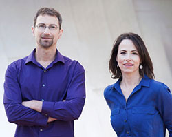
Fernanda Viegas, Martin Wattenberg, Google
Abstract: Machine learning is playing an increasingly influential role in the world, due to dramatic technical leaps in recent years. But these new developments bring their own questions. What is the best way to train models and to debug them? How can we understand what is going on under the hood of deep neural networks? It turns out that visualization can play a central role in answering these questions. We'll discuss recent work that shows how interactive exploration can help people use, interpret, and learn about machine intelligence.
Bio: Fernanda Viégas and Martin Wattenberg co-lead Google’s PAIR (People+AI Research) initiative, part of Google Brain. Their work in machine learning focuses on transparency and interpretability, as part of a broad agenda to improve human/AI interaction. They are well known for their contributions to social and collaborative visualization, and the systems they’ve created are used daily by millions of people. Their visualization-based artwork has been exhibited worldwide, and is part of the permanent collection of Museum of Modern Art in New York.
Closing
Alexander Lex, Torsten Möller